
Accessibility enables people with disabilities to perceive, understand, navigate, interact with, and contribute to the web. Imagine a world where developers know everything there is to know about accessibility. You design it and they build it… perfectly. In this world, only the design itself can cause people with disabilities to have trouble using a product.
These guidelines will cover the major things you need to know in order for your products to be “design-ready” to meet the minimum of standards in Section 508 and the Web Content Accessibility Guidelines 2.0. The rest will be up to development and quality testing.
1. Accessibility is not a barrier to innovation.
Accessibility will not force you to make a product that is ugly, boring, or cluttered. It will introduce a set of constraints to incorporate as you consider your design. These design constraints will give you new ideas to explore that will lead to better products for all of your users.
As you read through these guidelines, consider that we don’t want to design for our design peers.
Design for the diverse set of users who will interact with your products.
This can include people who are blind, color blind, or have low vision, those who are Deaf or have hearing difficulties, people with mobility impairments which may be temporary or permanent, or people with cognitive disabilities. Design for people who are young, old, power users, casual users, and those who just enjoy a quality experience.
Embrace these accessibility guidelines as you would any set of design constraints. They are part of the challenge of creating amazing products.
2. Don’t use color as the only visual means of conveying information.
This helps users who are unable to, or have difficulty with, distinguishing one color from another. This includes people who are color blind (1 in 12 men, 1 in 200 women), have low vision (1 in 30 people), or are blind (1 in 188 people).
Use color to highlight or complement what is already visible.
In this example shown in grayscale, how many fields would you say are in an error state?
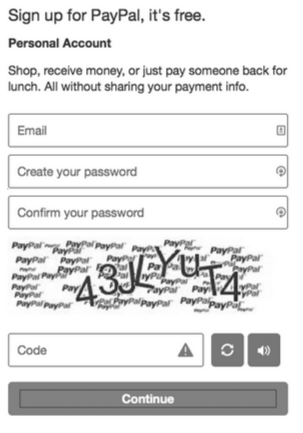
Most who see this in grayscale say the answer is one, the “human verification” field. That is because the triangle with the exclamation mark inside indicates that something is amiss.
Now look at this same screen in color. How many fields are in an error state?
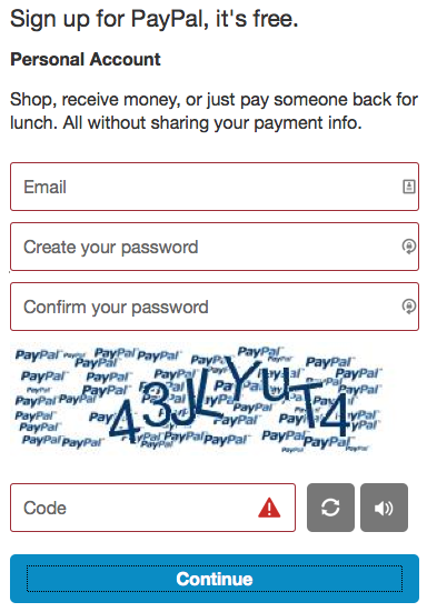
With color the answer becomes, “all four”.
There are many acceptable ways to make this form visually accessible. You could put the red triangle icon in all of the error fields. You could use text to indicate and explain why a given field is in error. You could use tooltips, thick borders, bold text, underlines, italics, etc. The choices are infinite,
but the only rule is to use more than color alone.
How would you design this signup form so that color isn’t the only visual means of showing a field with an error?
Update: It turns out that the accessibility issue described above in the PayPal example is caused by the LastPass plugin in my browser. Thanks to Tony Amidei (@subface) from PayPal for pointing this out to me. As designed, the triangle icons should always appear on fields in an error state.
3. Ensure sufficient contrast between text and its background.
According to the WCAG, the contrast ratio between text and a text’s background should be at least 4.5 to 1. If your font is at least 24 px or 19 px bold, the minimum drops to 3 to 1.
This guideline helps users with low vision, color blindness, or worsening vision see and read the text on your screen.
This means that when text is 24 px, 19 px bold, or larger, the lightest gray you can use on a white background is #959595.
For smaller text, the lightest gray you can use on a white background is #767676. If you have a gray background, the text needs to be darker.
There are some great tools that can help you find an accessible color palette for your designs including Color Safe. There is also WebAIM’s Color Contrast Checker, which will let you test colors you have already chosen.
Logos or elements currently in a disabled state are exempt from this standard. This includes inactive buttons or menu items. Placeholder or ghost text for form fields are not exempt from this standard.
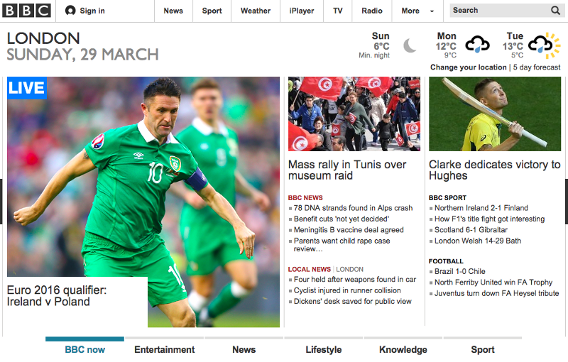
Here is an example from a popular blogging site with text contrast that is below standards. Only the contrast of the giant letter “M” meets standards.
The following example from the BBC shows a UI with passing color combinations. You can tell they are actively looking to pass contrast ratios since their lightest gray is #767676.
I am proud to work with the Salesforce Design Systems team, where they embraced color contrast guidelines for the Salesforce1 mobile application.
Explore using high contrast color combinations. Designers who have gone through this exercise are often surprised by how much they prefer higher contrast designs. I am confident you too will find that displaying text using the minimum allowable contrast will not detract from your products.
Check out Projectors Don’t Lie and Accessible Interface Design for more on color contrast.
4. Provide visual focus indication for keyboard focus.
Let’s take a moment to give thanks for the reset style sheet and all of the utility it has given the modern web designer. Without reset style sheets, it would be much more difficult to create a consistent experience across different devices and browsers.
Let’s now take a moment to blame reset style sheets for playing a role in one of the most widespread accessibility blunders on the Internet.
:focus {outline: 0;}
This single line of CSS makes it nearly impossible for a sighted user to use a website with just a keyboard. Fortunately, since the initial CSS resets were released, many popular ones including Eric Meyer’s have been updated to remove un-styling of the :focus pseudo-class.
The intent of un-styling focus was noble enough: remove default focus styles with the intention that designers and developers will replace them with something that is both visible and matches the style of their web pages. It’s easy enough to dislike the grey dashed border focus on IE and Firefox or the blue halo in Chrome.
The problem is, most websites do not create their own focus styles. These focus indicators, which are fundamental to the success of keyboard users, are largely absent on the web.
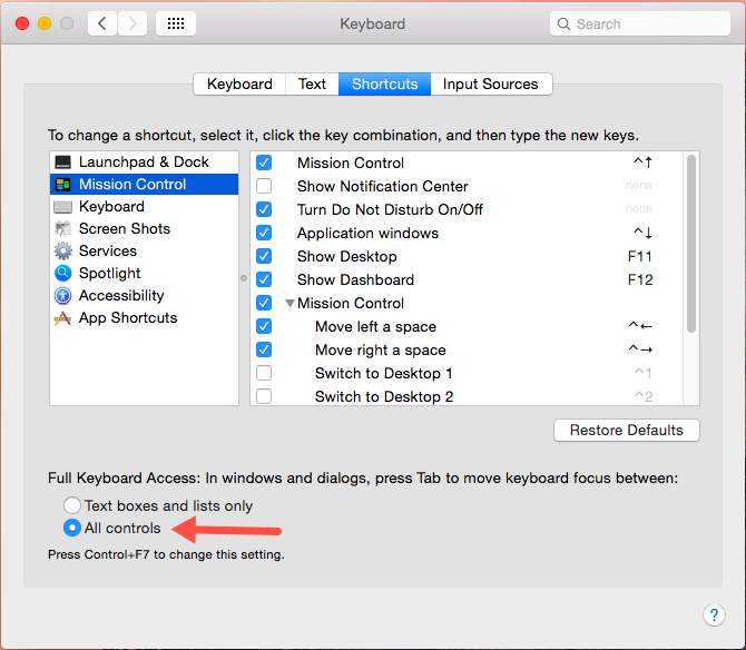
As a quick exercise to experience a website that doesn’t always provide visual focus, open a tab and visit the website for the company who makes your mobile phone. Press the Tab key repeatedly to navigate through the page. Do you see a visual focus indicator as you navigate? Maybe you see this for some links on the page but not all? Consider the effect this has on someone who only uses a keyboard to interact with the web. If you’re on a Mac, you may need to enable Full Keyboard Access under System Preferences > Keyboard > Shortcuts. It’s at the bottom.
If you remove default focus, replace it with something that is *better* than what your browser provides.
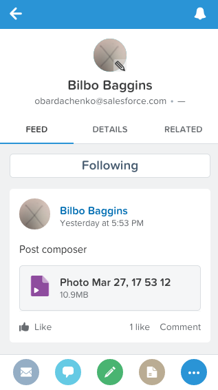
In the example below, the BBC uses a color bar to indicate which section’s link is in focus.

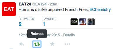
Twitter uses a combination of default focus and a tooltip to show keyboard focus. The icon also goes from gray to green. That’s three separate visuals to indicate focus for keyboard users.
When providing your own focus states, just be sure to remove the default state so that you don’t get something looking like this example where Chrome’s blue rectangle overlaps this menu’s blue pill.
5. Be careful with forms.
In recent years we have experienced a de-evolution in form fields. Modern designs have foregone traditional identifying attributes and interactive affordances in favor of a more minimalist approach. Today’s forms lack two specific items that are vital for accessibility: clearly defined boundaries and visible labels.
Forms without Borders
Below is an example of a traditional text input. It is a rectangle with a defined boundary. It can be filled with color, but does not have to be filled. There is also a visible label, which in this example sits to the left of the field.
Clearly defined boundaries for form fields are important for users with mobility impairments and those with cognitive disabilities. Knowing the location and size of the click target is important for people using a standard or adaptive pointing device. Users with cognitive disabilities may have difficulty finding and interacting with fields without common visual cues.
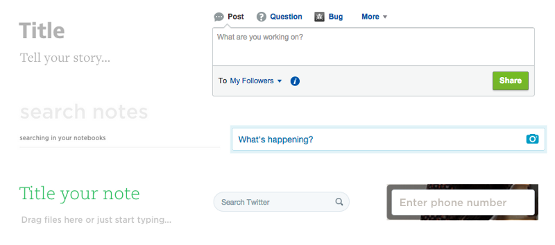
Below is an example of a search field from a popular note-taking app.
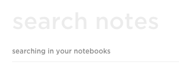
There is only one input on this screen. Can you guess the boundaries of the form field? Clicking anywhere on the words, “search notes”, will place you inside of the input.
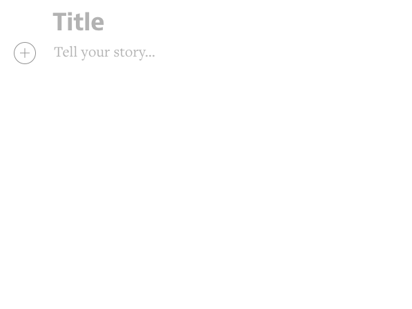
Here is another example form fields without boundaries from a popular blogging platform. Below there are two input fields on the page. Where on the screen can I click in order to enter the “Tell your story…” text area?
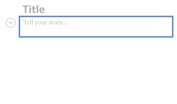
Here is the same screen shot with a blue rectangle added to show the boundaries of the text area. If you click anywhere below this region, nothing happens.
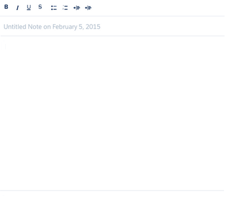
Below is another example of a note-taking design. This also does not use traditional input visuals, but provides users with disabilities more information. The title of the note goes between the two horizontal lines, and the user can click anywhere between the bottom two lines to begin typing their note.
Can you think of some other options for these designers? How would you design a note taking or blog publishing app?
Forms without Labels
Labels tell the user the purpose of the field, maintain their usefulness when focus is placed inside of the field and remain even after completing the field. Placeholder text is a poor replacement for a visual label.
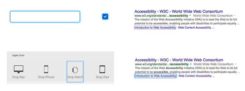
They are typically of low contrast. Of the seven examples below, only one has enough contrast to meet our needed 4.5:1 ratio.
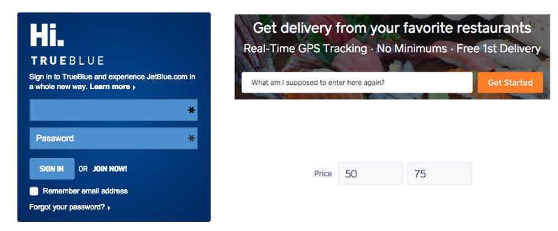
Placeholder text goes away. In the examples below, what am I supposed to enter into the text field? For the JetBlue example should I enter my username, my email address, or my TrueBlue number? For the Caviar example, should I “Get Started” by typing in my favorite food, a preferred restaurant, or my address? Are the price fields for min and max, over and under, or before and after?
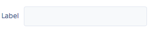
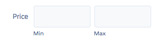
Here is a more accessible way of designing the Price compound field shown above. We will see the labels, min and max, even after we fill in the fields.
6. Avoid component identity crises.
Q: When is a menu no longer a menu?
A: When it’s a non-modal dialog.
This question is at the core of today’s biggest web accessibility problems. In order to understand this fully, consider the W3C’s Authoring Practices for Design Patterns. This is the guide for how to build an accessible version of many of today’s common design patterns including menus, modals, autocompletes, trees, tabsets, and many others.
Each of these patterns have a specific set of expected HTML semantics, keyboard behaviors and ARIA attribute usage. These ARIA attributes instruct screen reader users on how to interact with a component when using the keyboard. They also provide status updates while the user is interacting with a component. For instance, they instruct people interacting with a menu to use the arrow keys to move up and down the list.
Meet the humble autocomplete typeahead.

Here is the same typeahead, but with icons next to each list item.
These are essentially the same exact UI pattern. The user types into an input field. A box of results filtered on the entered text appears below. The user can then use the arrow keys or mouse to locate and select an item from the list.
The example below is an autocomplete with an identity crisis. Not only can the user filter and select an item from a list, they can choose to edit or delete each list item by clicking on the pencil or trash can icon. The addition of these two buttons is what gives this autocomplete an identity crisis.
This causes accessibility problems in part because it breaks form with the standard keyboard interaction model for an autocomplete. Assistive technology cannot always communicate the identity, operation, and state of confused components, as the W3C’s WAI has not defined a specification for communicating this type of UI.
The same rule holds true for menus. In the examples below from Virgin America, while very similar visually, only the drop down on the right is an actual “menu”. The one on the left is a non-modal dialog.
A menu is a widget that offers the user a list of choices. As soon as we offer multiple choices per row, as the example on the left does, we no longer have a menu. This changes the keyboard interaction model from using arrow keys, to using the tab key. It changes how keyboard focus is handled and where it goes once the dropdown is closed.
Unlike in the example above with autocompletes, non-modal dialogs can fortunately be made accessible. Know the difference between them and the effect it has on the user experience. Understand how minor design changes could lead to changes in a user’s interaction model. This will enable you to choose the appropriate pattern for your product.
7. Don’t make people hover to find things.
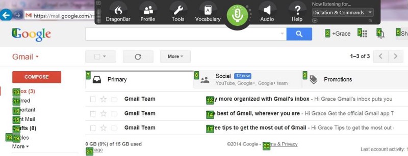
This principle mainly serves people with motor-related disabilities. This includes keyboard-only users who have vision, and those who use speech recognition tools like Dragon NaturallySpeaking to interact with web pages. Keyboard users and assistive technologies like Dragon rely on actionable items being visible on the screen. If a link or button cannot be seen by Dragon, it cannot be verbally “clicked”. If a keyboard-only user cannot see that a button exists on a page, how can we expect them to navigate to the empty space where it will ultimately appear?
Below is a screen shot from Gmail with Dragon Naturally Speaking showing an overlay with hyperlinks identified by number. The user can now speak a number out loud and activate a link. What happens if a link isn’t visible until a region is hovered upon? We would have numbers showing next to empty spaces.
I understand how this practice of hiding actionable items under hover states gained popularity. It serves as a solution to the well-established usability heuristic noted by Computer scientist Alan Kay.
Simple things should be simple, complex things should be possible.
I am a firm believer in this heuristic, but it should be applied in a way that makes the complex possible for all users, including those with disabilities. Unfortunately for accessibility, many have taken this to mean the following, which is not a quote from Alan Kay:
Primary things should be visible, secondary things should be shown on hover.
Instead of hiding actions and information behind hover states, explore more inclusive alternatives.
- Place secondary actions inside of menus (or non-modal dialogs), without using hover states to hide the trigger.
- Lighten the contrast of secondary icons and darken them on hover.
- Use tangible items as triggers for larger hovers. An info icon is a better trigger than white space to launch a content-filled hover.
Here’s an example from LinkedIn. Below is a screenshot from my profile page.
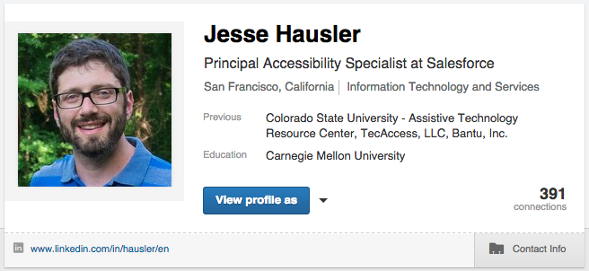
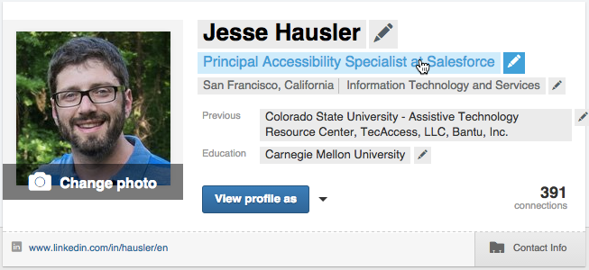
Here is what happens after I hover my mouse over the profile card.
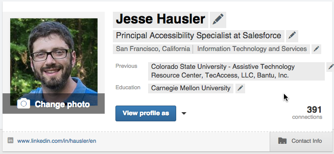
Suddenly there are visual indications that I may individually edit many of the fields on this page including my name, title, previous jobs, education and even my profile photo. Taking this one step farther, when I hover specifically over my title, the text turns blue indicating that I am ready to click.
Below is one solution to the accessibility problems this design may cause certain groups of users. I have smaller pencils that appear nearby the fields. They are always present.

When I hover over a field, the blue kicks in. When presented with this type of solution, designers may respond by asking:
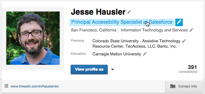
That’s kind of heavy, isn’t it?
Perhaps it is, but it’s only one possible solution to this problem. Furthermore, it only appears on my own profile page. How much time does one spend looking at their own LinkedIn profile? Is this level of “weight” a fair trade for universal accessibility? What other affordances can we provide if we don’t like this particular use of pencils?
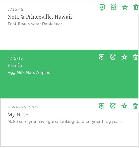
Here’s another example from Evernote. This is a list view of notes. When the user’s mouse hovers over a row, four actionable icons appear.
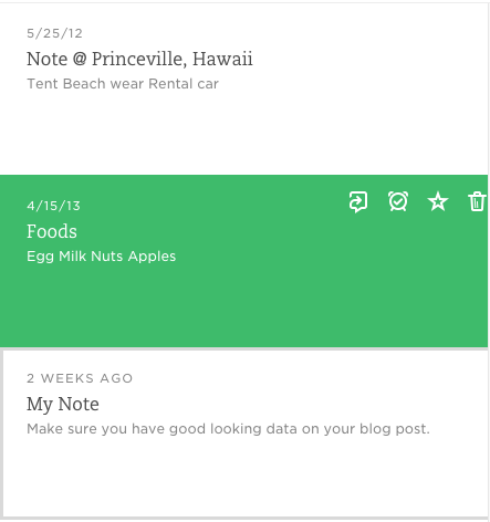
In this case, I would ask the designer to explore always showing these four icons. One possible solution would be to always show these icons. They could be green on the white rows and reverse on hover.
This solution might also be called “heavy”, but remember that we aren’t designing for designers. We are designing for a diverse set of users with different needs and varying technologies for accessing computers.
On the surface it may seem that placing these limits on your use of components, hover states, and visual design limit your creativity. If anything, these guidelines will push the limits of your creativity as you find visually pleasing designs that enable the success of a wider set of users.
With the right focus, you will find that any design challenge can be met in a way that meets the needs of your executives, marketing team, Dribbble followers and all of your users, including those with disabilities.
Click here to read this article as printed with examples as referenced
Jesse Hausler is a 12 year veteran of the accessibility field. He is currently the Principal Accessibility Specialist at Salesforce, where he has been for four years. Special thanks to Cordelia McGee-Tubb for the amazing artwork used throughout this blog post.